

Building an Employee Survey Dashboard with Supabase and N8N

Many companies use questionnaires to keep track of their employee’s health and general wellbeing. Because of the time and complexity involved in building one, many choose to go ahead with off-the-shelf solutions that may be quick to set up but have poor analytics tools. For example, the organization might be interested in knowing specifics about the use of the survey/questionnaires. For example (include one or two examples here) But there’s something better than off-the-shelf, and it can be built using Appsmith.
In this article, I will teach you how to build a custom employee survey dashboard to fit your specific requirements. We’ll achieve this by tying together the best open-source tools in the business to build powerful workflows.
We’re going to cover a lot, but specifically, you will learn how to:
- Use Supabase as a data source
- Use filters in DB queries
- Display data in charts
- Perform email automation with N8N
You can peek ahead to see the app we’ll be building here. Let’s get started!
Project set up
As mentioned earlier, we’ll be using Supabase as our storage DB. Signup for Supabase and create three tables; an employee, a question, and a responses table. You can seed the database with this dummy data
You should also go-ahead to set up N8N. You can signup for the cloud version or self-host it. Create a new workflow, and we’ll come back to it in a bit.
Lastly, signup for Appsmith and create a new app. Go to Datasources > Create New > PostgreSQL and fill the form to connect to your Supabase instance.
Awesome! With this, we have completed all the setup. Let’s begin writing queries.
How to use filters in DB queries
We need to write a query to get questions from the DB. Let’s call this query get_questions, and it should look like this:
SELECT * FROM public."questions";
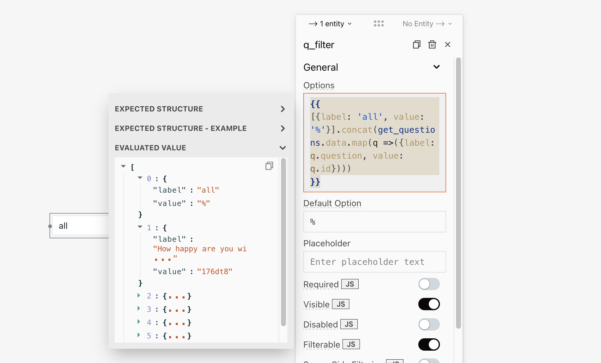
With the returned data, we can build a question filter. Drag in a select widget and configure its Options property shown below.
The name of the widget has been updated to
q_filter
{{
[{label: 'all', value: '%'}]
.concat(get_questions.data.map(q =>({label: q.question, value: q.id})))
}}
Similarly, go ahead to build a team filter. Name the select widget t_filter, and its Options property should be:
[
    {
    "label": "all",
    "value": "%"
  },
    {
    "label": "hr",
    "value": "hr"
  },
  {
    "label": "marketing",
    "value": "marketing"
  },
  {
    "label": "engineering",
    "value": "engineering"
  },
    {
    "label": "logistics",
    "value": "logistics"
  }
]
Using the filters we just built, we can write filtered queries i.e., to get employees based on the selected team and get responses based on the chosen question and team.
Create a new query for employees and update its name to get_employees. The query should look like this:
SELECT id AS employee, name, email, team FROM public."employees"
WHERE team LIKE "{{t_filter.selectedOptionValue}}";
Similarly, the get_responses query for responses should look like this:
SELECT r."completedAt", r.employee, r.response, r.comment, e.age, e.sex, e.team
FROM responses r
INNER JOIN employees e ON r.employee=e.id
WHERE
    r.question LIKE "{{q_filter.selectedOptionValue || '%'}}"
    AND e.team LIKE "{{t_filter.selectedOptionValue}}";
Using a table widget, you can display the employee completion status like so:
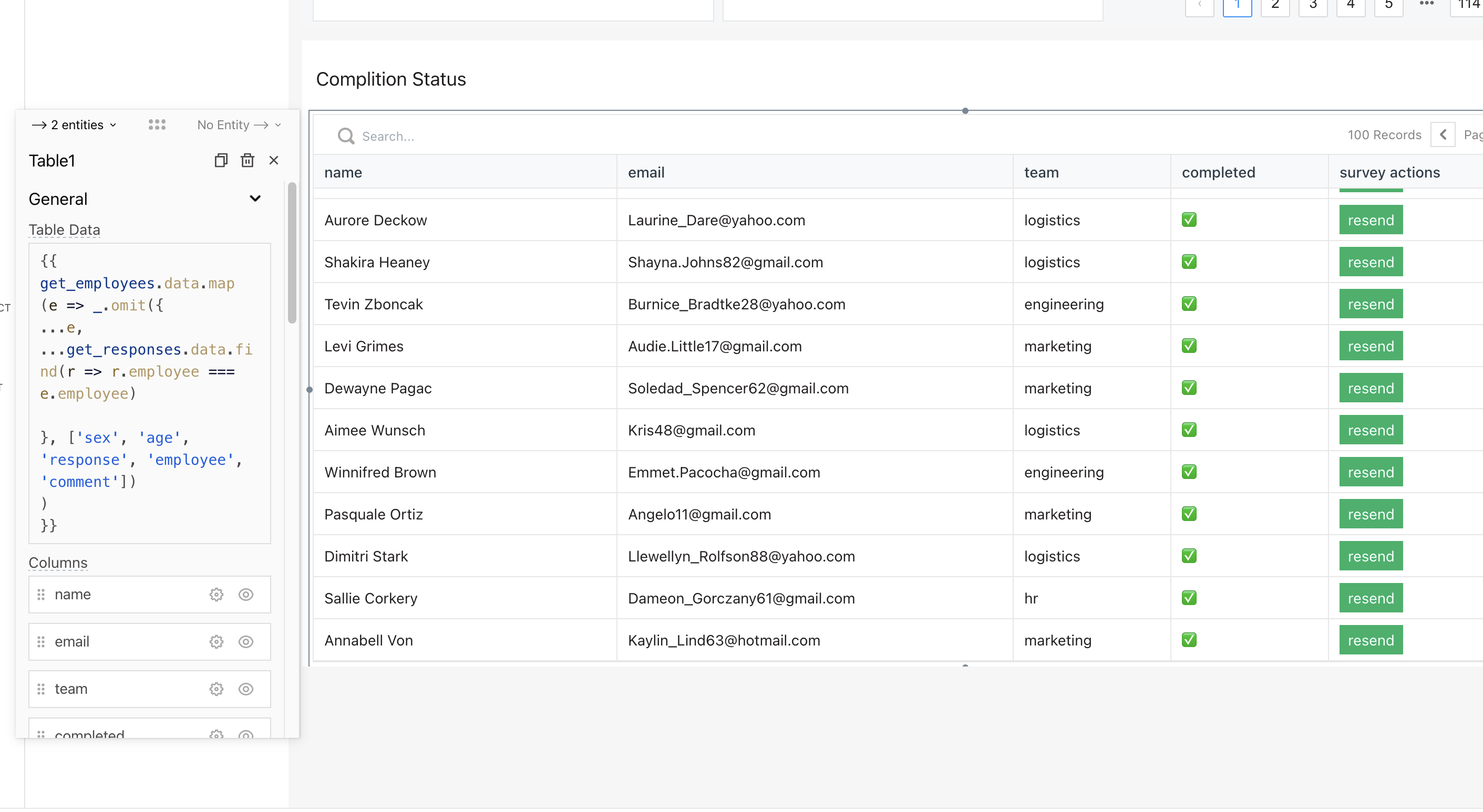
And, here’s the snipped used for the Table Data property:
{{
    get_employees.data.map
      (e => _.omit({
        ...e,
        ...get_responses.data.find(r => r.employee === e.employee)

      }, ['sex', 'age', 'response', 'employee', 'comment'])
      )
}}
How to display data in charts
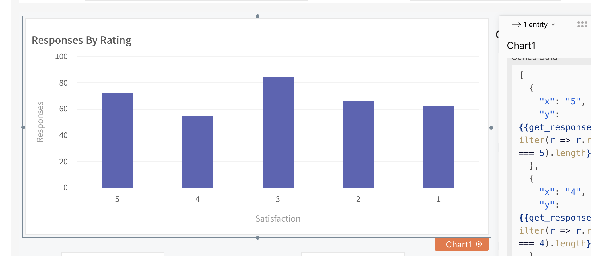
In the last section, we wrote a query to get responses for the selected question and team. Now, we’re going to focus on displaying the data in charts.
From the widgets tab, drag a chart widget into the canvas. We want this chart to display the aggregate number for responses for a particular rating level, i.e. 26 employees rated 5. So for the Series Data property on the chart widget, use the snippet below:
[
  {
    "x": "5",
    "y": {{get_responses.data.filter(r => r.response === 5).length}}
  },
  {
    "x": "4",
    "y": {{get_responses.data.filter(r => r.response === 4).length}}
  },
  {
    "x": "3",
    "y": {{get_responses.data.filter(r => r.response === 3).length}}
  },
  {
    "x": "2",
    "y": {{get_responses.data.filter(r => r.response === 2).length}}
  },
  {
    "x": "1",
    "y": {{get_responses.data.filter(r => r.response === 1).length}}
  }
]
And your chart should look like this:
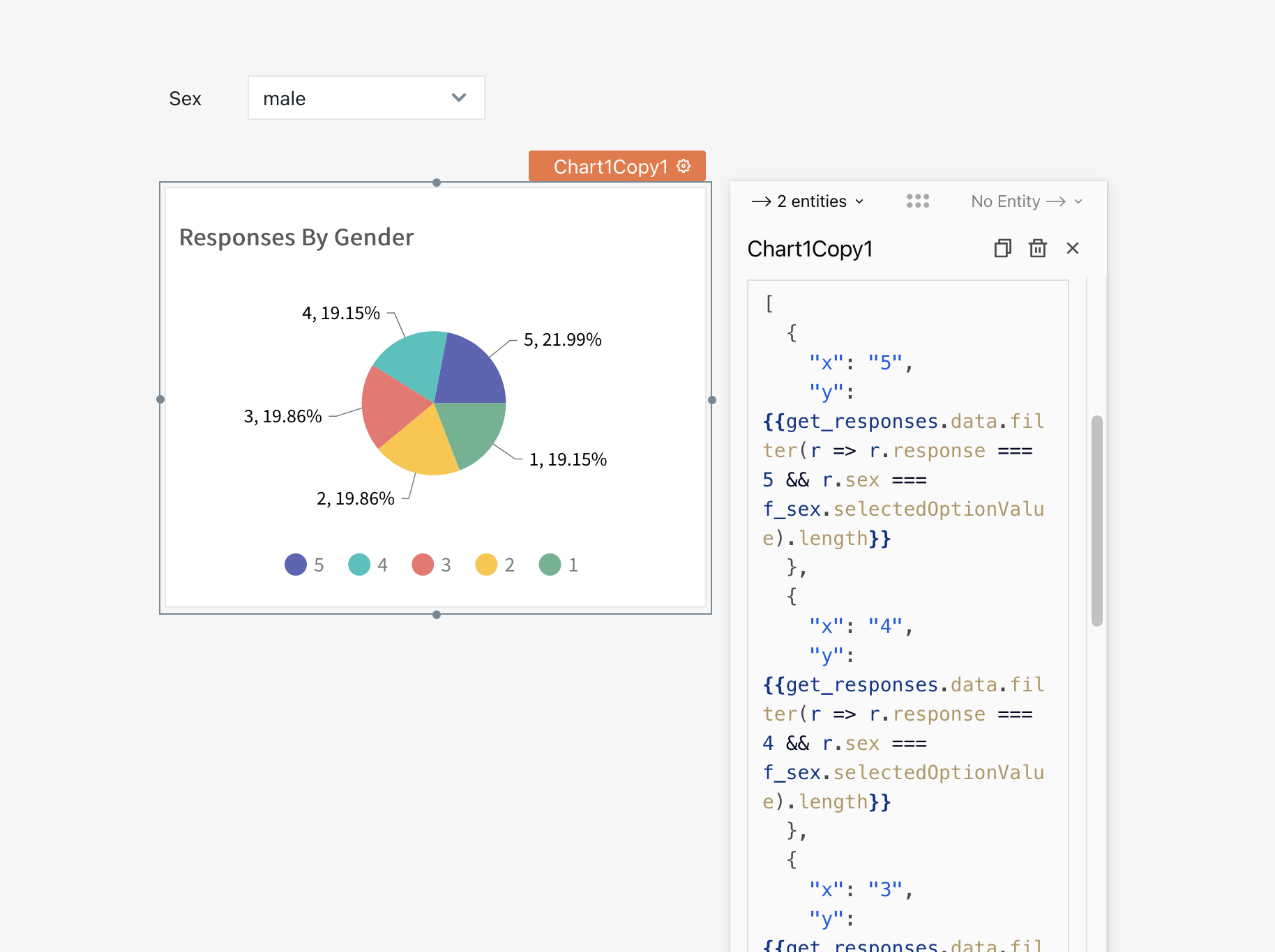
We can also display responses by gender. For this, we’ll need a sex filter. You know the drill, so go and make one. Here’s mine (named f_sex):
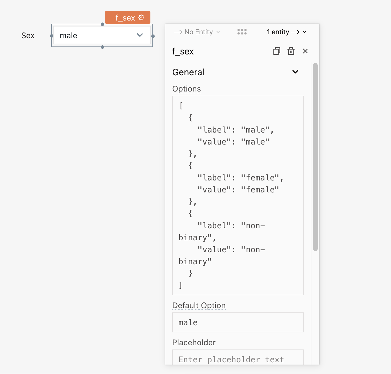
And now, we can display the data using a chart widget set to a Pie Chart Chart Type. Here’s the snippet:
[
  {
    "x": "5",
    "y": {{get_responses.data.filter(r => r.response === 5 && r.sex === f_sex.selectedOptionValue).length}}
  },
  {
    "x": "4",
    "y": {{get_responses.data.filter(r => r.response === 4 && r.sex === f_sex.selectedOptionValue).length}}
  },
  {
    "x": "3",
    "y": {{get_responses.data.filter(r => r.response === 3 && r.sex === f_sex.selectedOptionValue).length}}
  },
  {
    "x": "2",
    "y": {{get_responses.data.filter(r => r.response === 2 && r.sex === f_sex.selectedOptionValue).length}}
  },
  {
    "x": "1",
    "y": {{get_responses.data.filter(r => r.response === 1 && r.sex === f_sex.selectedOptionValue).length}}
  }
]
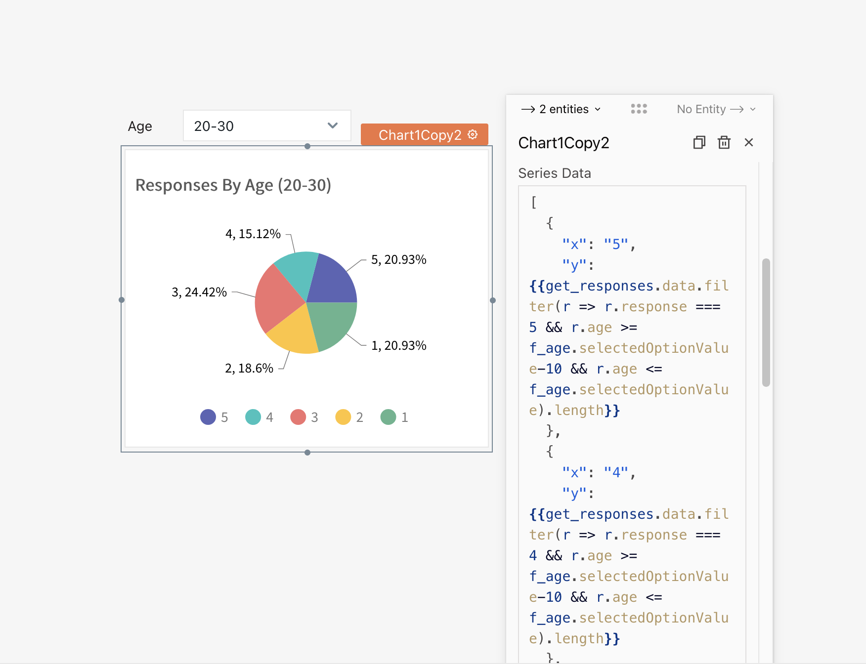
For some extra credit, use the principles above to build a filtered chart to display responses by age group. Here’s mine:
How to perform email automation with N8N
In this section, we’re going to look at how to send out emails from the dashboard using N8N.
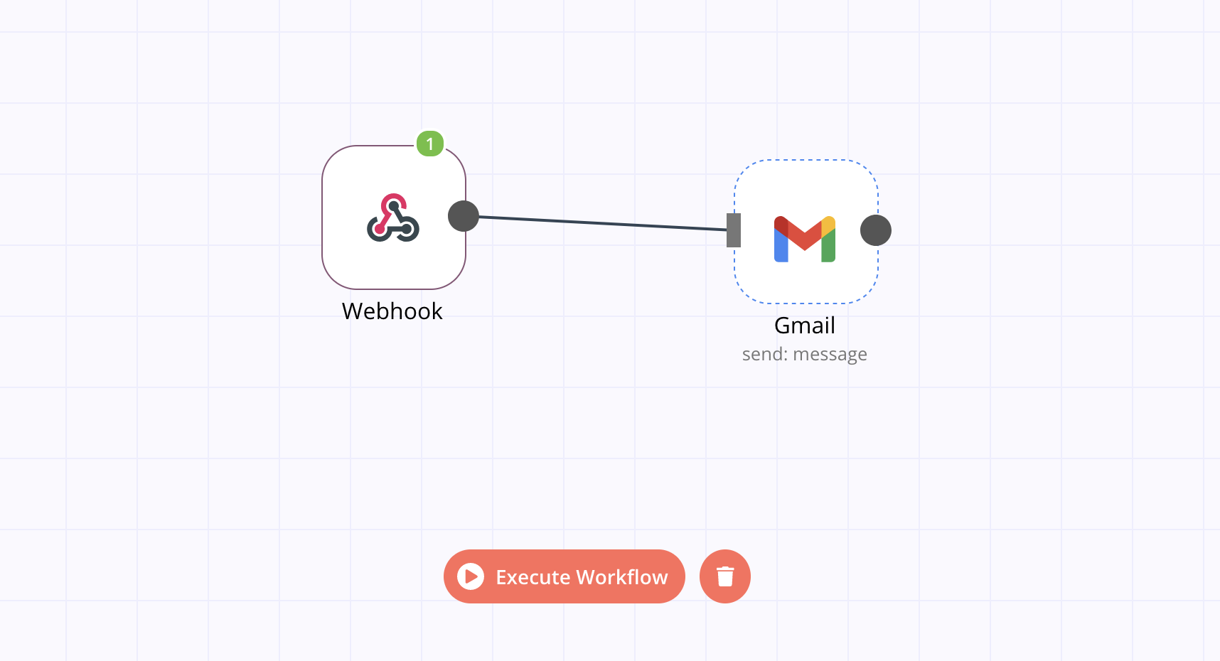
For employees who haven’t completed a survey questionnaire, we need a way to resend it to them via email. Let’s build an N8N workflow for this.
The workflow would consist of two nodes, a webhook that accepts post requests and the second being a Gmail node. Here’s a snapshot of the workflow:
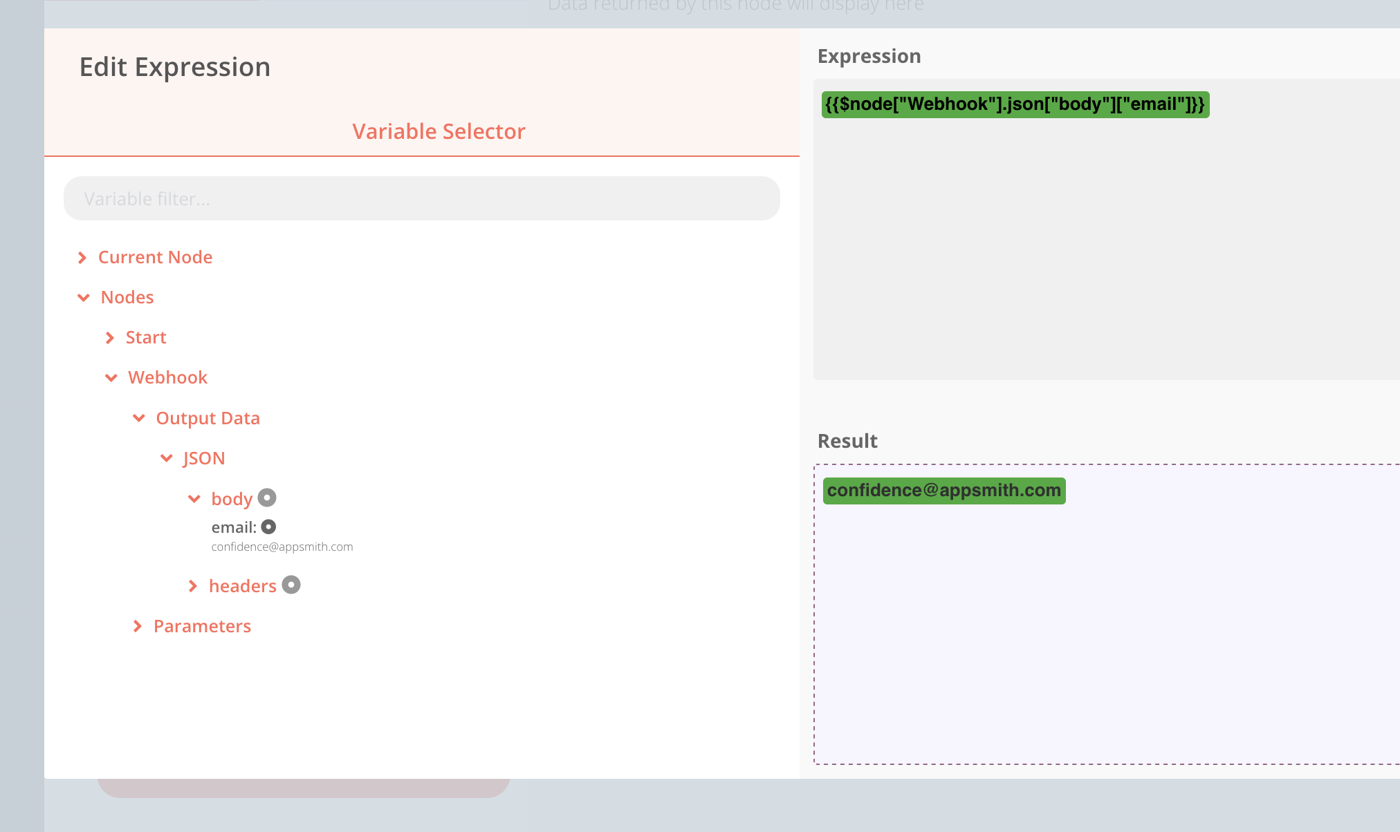
The Gmail node should be configured to send an email by setting the Resource to Message and the Operation to Send. The subject should contain a link to the questionnaire form, and the recipient email should be an expression that is evaluated the payload of the webhook as shown below:
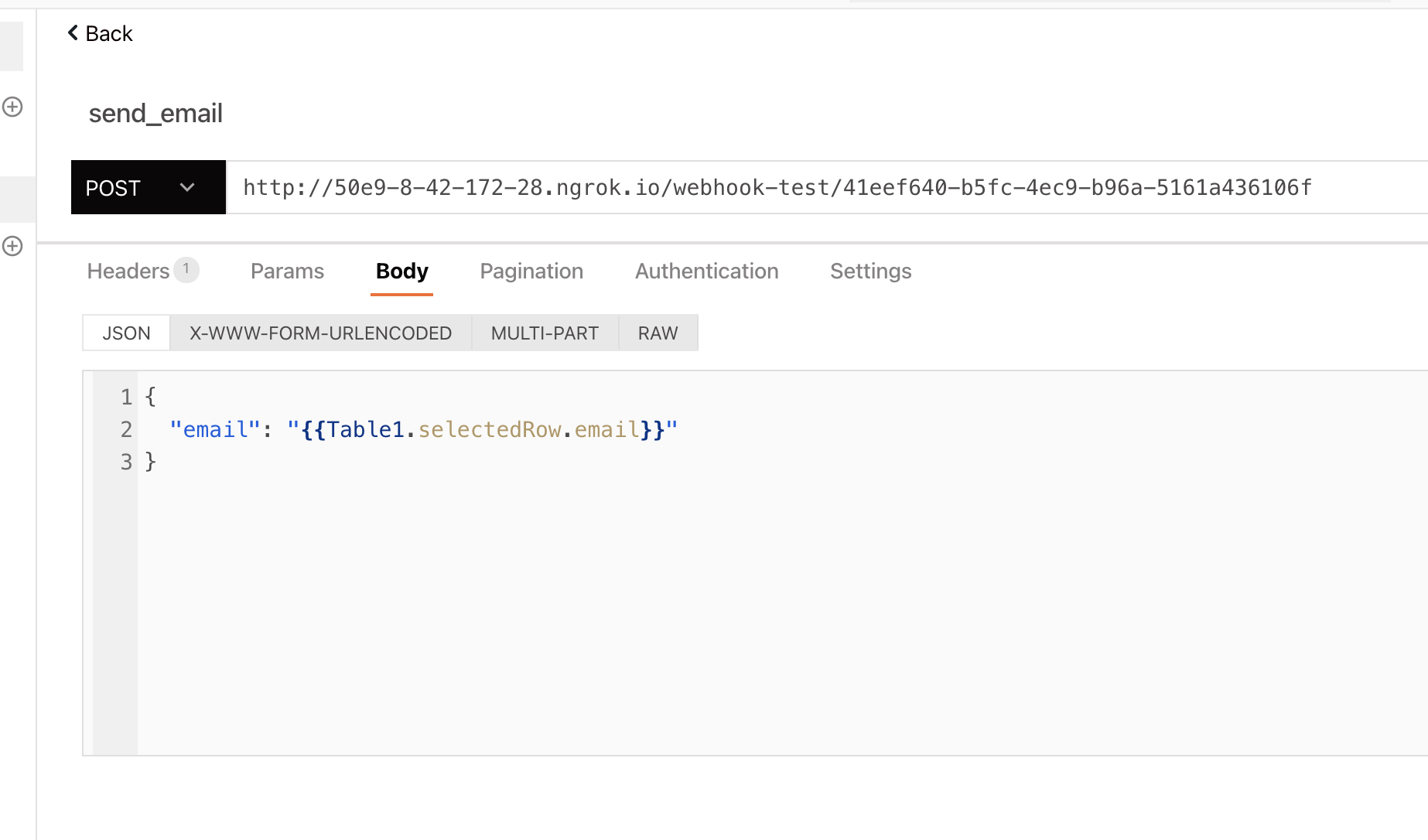
Going back to the dashboard, we can create a new API to trigger this workflow. Go to Datasources > Create New > Create New API and enter the URL of the N8N webhook. Give the request a name i.e. send_email, set the request type to POST, and the body would be the email of the employee selected from the table:
Now, going back to the table widget, we can create a custom column of Column Type Button. Configure this column to run the send_email API when it is clicked. Thus, clicking on the button for a particular employee would resend the questionnaire to that employee via email.
Wrap up

Awesome! We’ve been able to build the employee survey dashboard. You can take a look at the app here https://app.appsmith.com/applications/61281a99695af65b46d75843/pages/61281a99695af65b46d75845
You can expand on this and add more features to the app. The floor is all yours! We’d love to see what you add next. By the way, give us a star any time you visit github.


